Generic troubleshooting processes
Allegro Network Multimeter troubleshooting workflows
Every now and then we get asked, what a (generic) troubleshooting approach/workflow with an Allegro Network Multimeter would look like. And, rightfully so, because the endless possibilities of an Allegro might be overwhelming for some.
In this tutorial, we’ll go into several topics that might be of interest to you -the user- while working with an Allegro Network Multimeter.
The basics
It all starts with basic understanding about what’s actually presented on your screen.
When it comes to providing you with elementary yet essential and actionable troubleshooting insights, Allegro has got you covered with the “Top users” and “Quality” dashboards.
Both can be found at the top of the control menu, at the left hand side of the web interface.
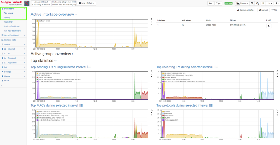
Above: access to “Top users” and “Quality” screens highlighted in the green box
TOP users
The “Top users” screen is a great place to start your generic troubleshooting workflow.
The top users screen provides you with high-level information about what is going on in your network.
On this page you will find trending graphs and tables, depicting total packets and bytes for the top 5 IPs, top 5 MACs and top 5 protocols that were traversing your network – during the selected time interval.
Toggling between tables and graphs, can be easily done by clicking the respective icon next to the widget’s caption.
When troubleshooting or better understanding network behavior, most of the times it makes sense to “take a step back” and look at the bigger picture or larger trend.
To accomplish this with your Allegro, you can switch the -viewable timeframe- at in the top right-hand corner of the web interface.
So for instance change the viewable timeframe from 1 minute to “1 day LIVE” or “Last day”, to get a clear overview of the TOP talkers over a 1 day timeframe.
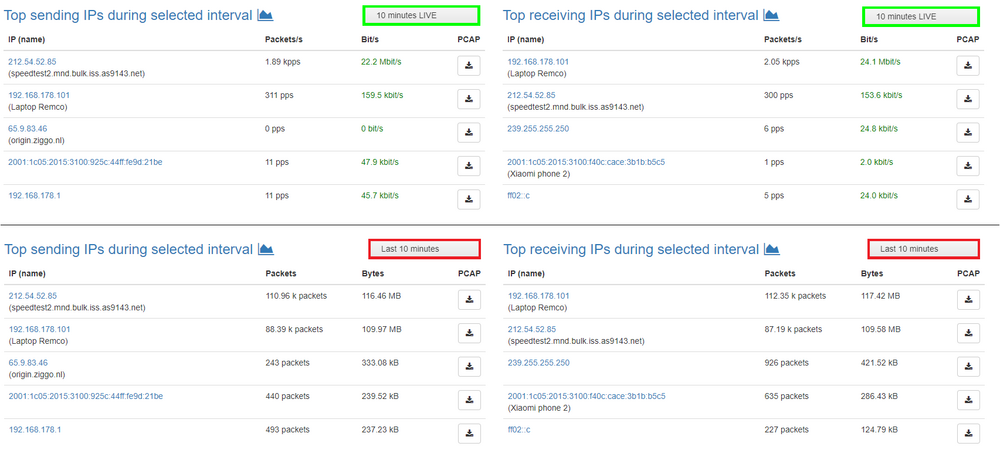
For identical time frames, let’s say “10 minutes LIVE” and “Last 10 minutes”, both view modes will display exactly the same graphs. Only in table form, the practical difference between the two becomes evident.
As becomes clear from the above illustration, LIVE-view will display TOP Talker information -for the selected LIVE timeframe- (in our case 10 minutes) accompanied with live traffic indicators based on packets per second and bits per second. When selecting the “Last 10 minutes” view mode, the TOP talkers will be accompanied by total traffic in packets and Bytes – during the selected time frame. This can be of great help to more quickly and easily identify communication relations. The download buttons, that you find everywhere throughout the Allegro web interface, give you quick and easy access to pre-filtered Pcap files.
Herewith Pcap files can be retroactively (back-in-time) extracted out of the Allegro’s ring buffer. The download buttons also can be used to initiate pre-filtered Live captures. E.g. clicking the download button next to IP 192.168.178.101, will initiate a capture that is already pre-filtered to only capture traffic containing that IP during the selected time interval. Again, such time interval may be in the past, as the Allegro can extract this from its packet ring buffer.
IP details page
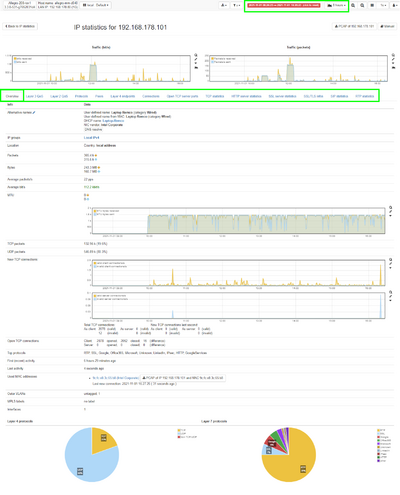
If you want very detailed information about a certain IP, go to the IP-details page of that specific IP. This is easily done, by clicking on an IP, everywhere throughout the Allegro web interface. This will bring you to the IP-details page of that specific IP-address. The IP-details page, gives you 1-click access to all sorts of network performance information -during the selected time frame-. The different tabs that you can go through on the IP-details page, are highlighted in green in the image below.
Click on the image below for an enlarged view of a full IP details page.
As you can see, it is very easy to look into and investigate the (mis)use of QoS and protocols by an IP. From the IP details page, you can also quickly and easily look into communication relations on the connection level and even dive into the TCP-statistics for that IP.
Quality dashboard
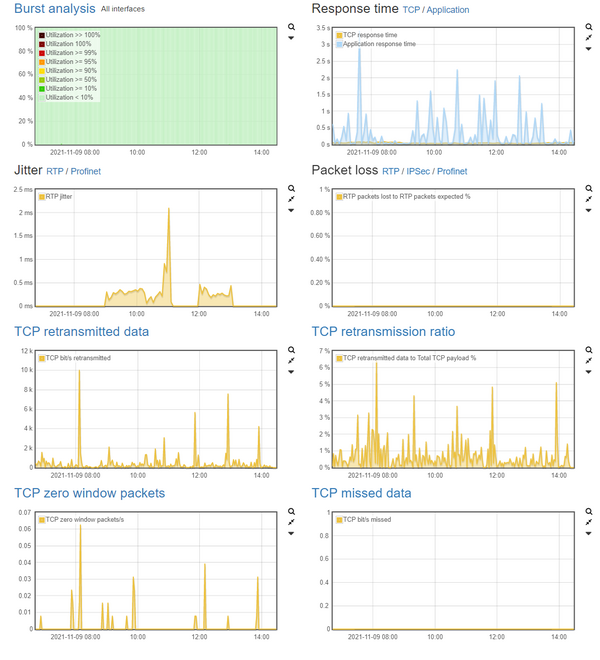
For quality and performance assessment, Allegro’s quality dashboard is a great place to start. All of the most important graphs, related to high level quality and performance monitoring/troubleshooting, are gathered on this page.
Burst Analysis
The first graph on Allegro’s predefined quality dashboard, represents “Burst Analysis”. Because the Allegro Network Multimeter supports data measurement intervals (sampling rates), as detailed as 1 ms, you can identify instances where a Link is 100% saturated, for very short fractions of time. Evidently, micro bursts could potentially be a root cause for network performance issues. Other than Allegro Packets, most monitoring & troubleshooting solutions are unable to pick this up, because of “low resolution” data sampling (i.e. 1, 5, or even 10 minutes).
Response times
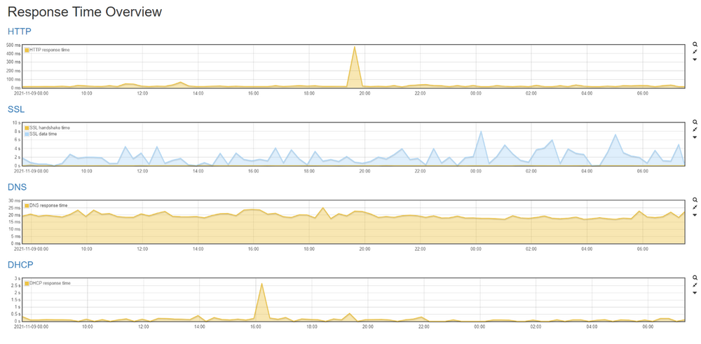
The second graph provides you with trending information about global response times for TCP and HTTP, SSL, DNS plus DHCP. Clicking on “Application”, will bring you to the response time overview page, where trending response time graphs for HTTP, SSL, DNS and DHCP are individually presented.
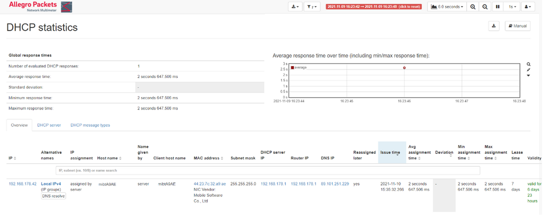
From here, it is very easy to identify -and zoom in on- timing related issues that happened on the network. In the 1-day time frame exampled above, clearly HTTP and DHCP show instances where response time deviated massively from the overall median line. You can select such a spike in the graph by clicking and holding the left mouse-button, selecting the spike and then releasing the left mouse-button. When zoomed in to your liking, click on the graphs title (e.g. DHCP) which will bring you to that specific details page.
Because you already zoomed into to a specific time frame on the graph, this page will now only show you the client / DHCP-server relations, that happened during the time frame that you selected in the graph. Also on this page, you’ll find a download button for simple (retroactive) extraction of a Pcap, that is pre-filtered to only contain DHCP and BOOTP packets.
UDP Jitter & packet loss
The next two graphs provide trending and actionable insights for UDP-based protocols RTP and Profinet. First up is the graph depicting Jitter over time. Bad jitter can have a very negative impact on business critical production services and on VoIP- / Unified Communication services.
From this graphs, it is very easy to quickly identify quality issues, such as instances where jitter is above 20ms in networks where VoIP is being used.
TCP retransmissions/packet loss
The next two graphs provide trending visibility and information about TCP packet loss in your network. TCP retransmission are seen in all networks, it’s the amount of retransmission -and better yet the retransmission ratio in percent- that indicate if things are problematic in your network. This is why graphs for both TCP retransmissions in absolute numbers, as well as in ratio are presented to you.
As a reference;
For wired infrastructures, a retransmission ratio of up to 2% is generally accepted to still be okay. In wireless infrastructures however, retransmissions of up to 10% are very common and considered to be a well-functioning wireless network.
TCP Zero window
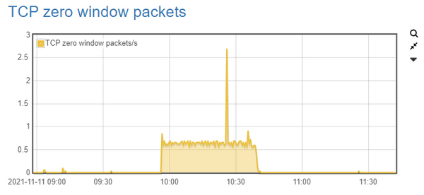
For identifying application performance problems and/or server capacity issues, the “TCP Zero Window” graph is a very, very powerful instrument. Here’s why… TCP zero window packets are being sent out by a client or (mostly) server, whenever it cannot optimally handle the oncoming traffic any more. Because of whatever reason, its receive buffer is full, and the device will start every sending party to slow down – by means of TCP zero packets.
Couple of reasons for high (continuous) counts of TCP zero window packets, may be things like:
- Too much oncoming traffic, relative to the NIC Link speed
- Applications that are too slow or problematic and therefore are unable to keep up
- Storage that is too slow or problematic, and therefore is unable to keep up.
