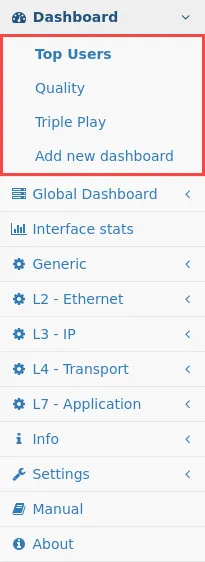
Dashboard
The dashboard gives a quick overview about the network traffic processed by the Allegro Network Multimeter.
There are three different dashboards available which focus on different aspects of the network traffic.
- Top Users
- Quality
- Triple play
Top Users Dashboard
Section titled “Top Users Dashboard”The Top Users dashboard provides an overview of the most active entities and protocols in the network traffic.
All sections can be minimized or maximized by click on the arrow next to a section.
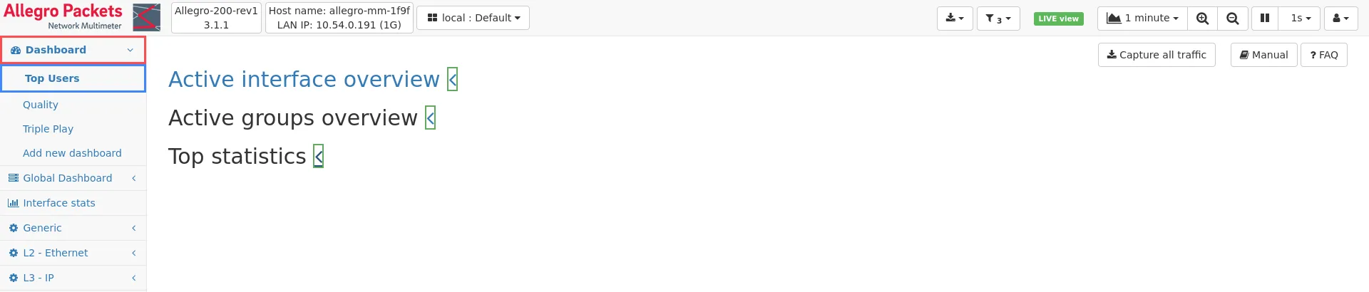
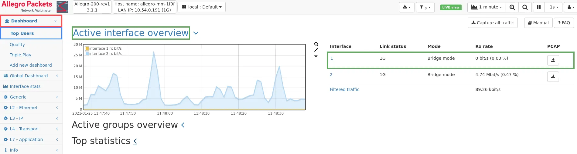
Active Interface Overview
Section titled “Active Interface Overview”This overview lists all active network interfaces used for traffic analysis.
A history graph shows the receive bitrate for each active interface.
The table next to the history graph contains the link status for each active interface including the active link speed, the current receive bitrate, the link utilization and a button that allows to capture the traffic of that particular interface. If a NIC filter has been configured, the filtered amount of traffic is shown in the last row of the table.
If no interface is active or the system is operating in one of the replay modes (e.g. PCAP replay, packet ring buffer replay) instead of the Active interface overview history graph a Traffic overview history graph is shown which displays the combined traffic processed by the system.
In case of active WiFi monitoring interfaces the Active Interface Overview graph will also show the traffic history of these interfaces, but the interfaces are listed in a separate table below the regular active interface table. Here the current receive rate, the channel/frequency and channel mode are shown for each WiFi interface. There is also a link to the WiFi interface settings as well as a PCAP button to capture the WiFi packets as a Radiotap PCAP.
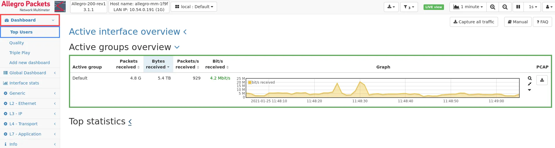
Active Groups Overview
Section titled “Active Groups Overview”The group list provides an overview of all groups for which traffic has been seen. The traffic counters and received traffic over time as a graph are shown for each group. A PCAP button is available for capturing the traffic for that group. This section is only visible if there are groups configured.
Top statistics
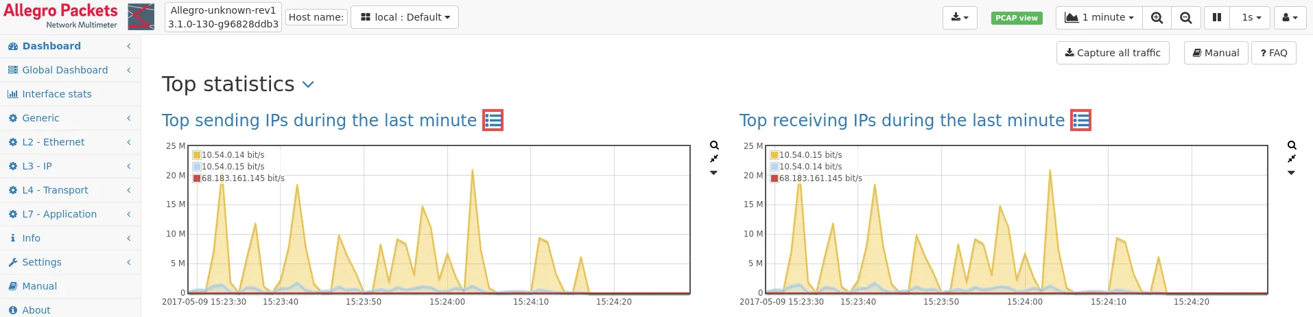
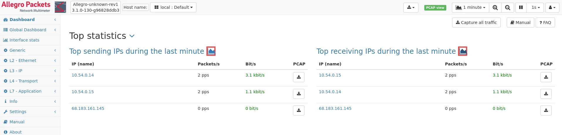
Section titled “Top statistics”Top sending IPs / Top receiving IPs
Section titled “Top sending IPs / Top receiving IPs”The Top sending IPs and Top receiving IPs panels show the top 5 most active sending/receiving IP addresses.
A button is available to toggle between list view and graph view.
In live view mode, the IPs are listed with the most bytes during the last minute.
If an interval is selected, the IPs with the most bytes in that interval are listed.
The list contains the IP address and name (if known) as well as the current packet rate and bit rate.
There is also a button to directly capture traffic for the corresponding IP address.
Each IP address in the list can be clicked to get to the IP details statistics of that IP, or the Top sending IPs / Top receiving IPs link can be clicked to get to the main IP module.
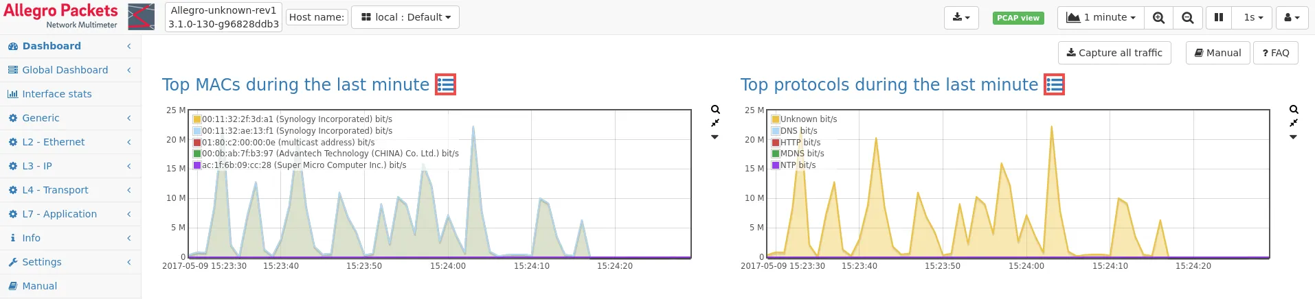
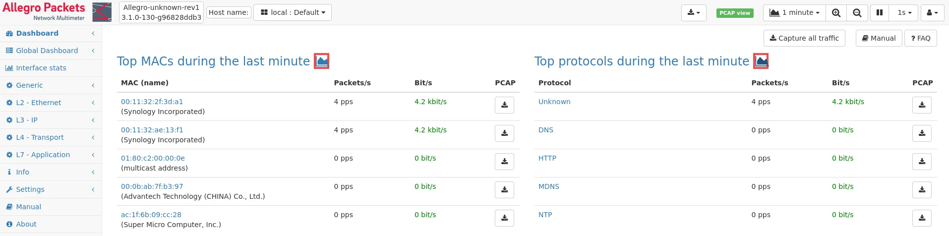
Top MACs
Section titled “Top MACs”Similar to the Top sending IPs / Top receiving IPs, the Top MACs panel shows the top 5 most active MAC addresses.
A button is available to toggle between list view and graph view.
In live view mode, the MAC addresses are listed with the most packets during the last minute. If an interval is selected, the MAC addresses with the most packets in that interval are listed.
The list contains the MAC address and name (if known) as well as the current packet rate and bit rate. There is also a button to directly capture traffic for the corresponding MAC address.
Each MAC address in the list can be clicked to get to the MAC details statistics of that MAC, or the Top MACs link can be clicked to get to the main MAC module.
Top protocols
Section titled “Top protocols”The Top protocols panel shows the top 5 most active network protocols.
A button is available to toggle between list view and graph view.
In live view mode, the protocols are listed with the most packets during the last minute. If an interval is selected, the protocols with the most packets in that interval are listed.
Each protocol in the list can be clicked to get to the detailed statistics for that protocol, or the Top protocols linked can be clicked to get the main L7 module.
Quality dashboard
Section titled “Quality dashboard”The Quality dashboard provides an overview of various quality-related metrics and their development over time.
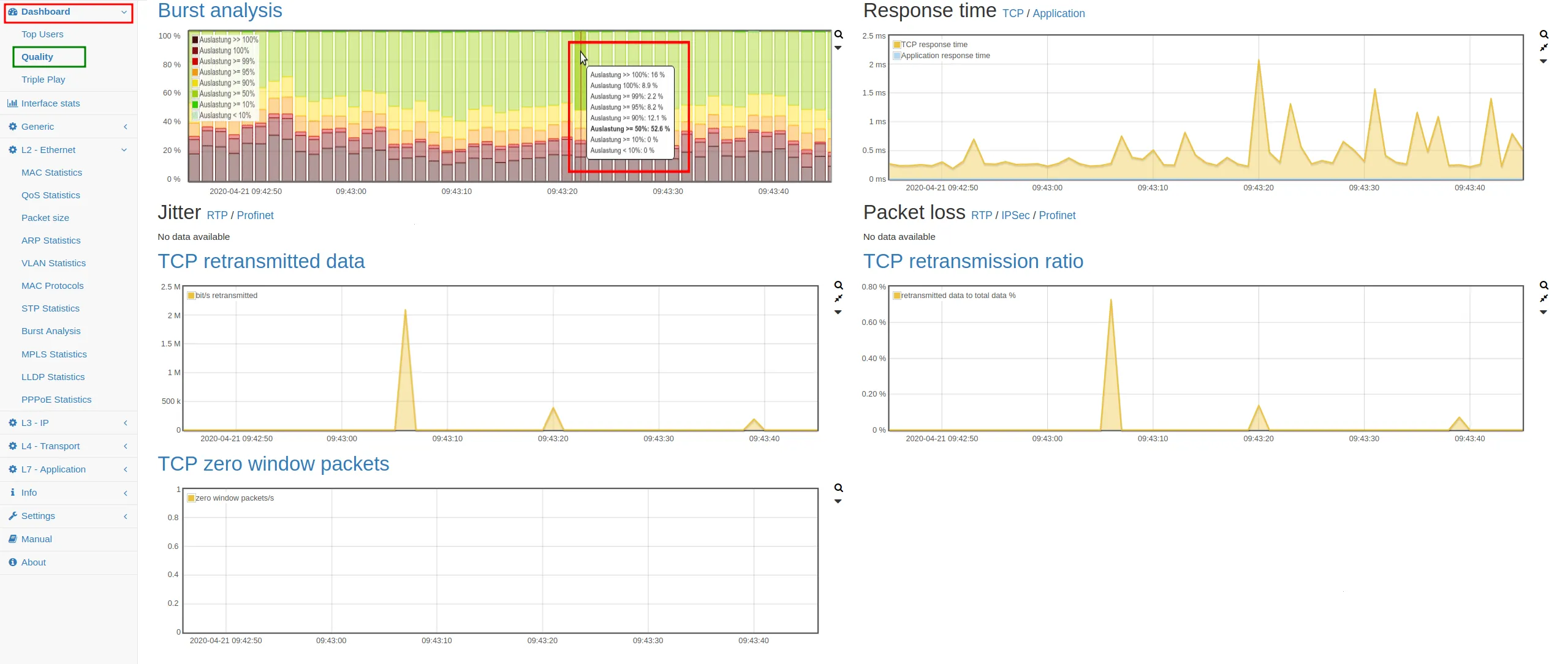
Burst analysis
Section titled “Burst analysis”This graph shows the combined network interface throughput utilization which is measured with 1ms resolution. A link to the detailed Burst analysis page is provided.
Response time
Section titled “Response time”Here the average TCP data response time and the combined average application response time are shown. There are two links which navigate to the detailed TCP response time analysis page and to the application response time overview page.
Jitter
Section titled “Jitter”This graph shows the average RTP jitter and the average Profinet jitter.
Links above the graph navigate to the respective detail pages.
Packet loss
Section titled “Packet loss”This graph shows the packet loss percentage for RTP, IPSec and Profinet.
Links above the graph navigate to the respective detail pages.
TCP retransmitted data / TCP retransmission ratio
Section titled “TCP retransmitted data / TCP retransmission ratio”The TCP retransmitted data and TCP retransmission ratio graphs show the amount and ratio of TCP data that was retransmitted due to packet loss.
More detailed information can be found when following the link to the TCP module.
TCP zero window packets
Section titled “TCP zero window packets”The TCP zero window packets graph shows the global number of TCP zero window packets over time. More detailed information like the number of TCP zero window packets per IP can be found when following the link to the TCP module.
Triple play dashboard
Section titled “Triple play dashboard”The triple play dashboard shows global data about VoIP and RTP protocols.
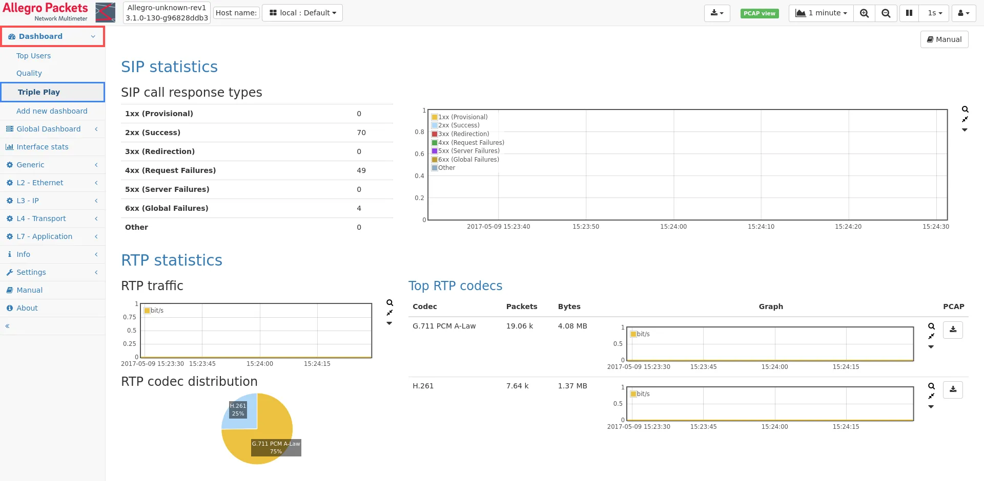
VoIP statistics
Section titled “VoIP statistics”The VoIP statistics panel shows SIP calls and their associated metadata.
RTP statistics
Section titled “RTP statistics”The RTP statistics panel shows RTP traffic of the last minute or of the selected interval. A pie chart shows the distribution of currently used RTP codecs. The Top RTP codecs table shows detailed statistics for the five most used RTP codecs. A PCAP button allows capturing traffic for a certain codec.